5,716 reads
How to Draw an Attractive Convenient Table — Design Techniques and Examples
by Evgeny BondkowskiJune 16th, 2023


Too Long; Didn't Read
In this article, I show different table design techniques and examples of their application. You can use it in any application, not only in graphics editors (like Figma, InDesign, and Photoshop) but in Exel, PoverPoint, and Word. It will be especially useful for non-designers or novice designers to quickly get acquainted with how to design a table.


In this article, I want to show different table design techniques and examples of their application. You can use it in any application, not only in graphics editors (like Figma, InDesign, and Photoshop) but in Exel, PoverPoint, and Word. It will be especially useful for non-designers or novice designers to quickly get acquainted with how to design a table differently and choose the appropriate option for their project. As well as experienced professionals who rarely draw tables.
A rectangular table, along with text and illustrations, is one of the main ways to visually convey information. There are especially many tables in complex interfaces. Usually, for large enterprise applications for desktops, a data table is the main thing that the user works with. On long reads, tables become the most noticeable visual element that stands out among the text, attracts the most attention, and set the entire style of the page or site if there are no illustrations. Therefore, the design of tables is very important, and it is worth allocating a separate time for this to get a high-quality design of a website, presentation, or printed document.
1. Table design techniques
A regular table consists of rows and columns separated by uniform lines, enclosed within a frame. This type of table can be easily created using Excel. It serves as a universal option when designing resources is not feasible. However, for designers, it is considered a starting point for further customization.


The opposite option is a table without lines. Only data and no registration. It looks good in an airy design, and only when there is very little data (columns and rows) and a lot of space. But it is still more difficult to read the information than if there is a minimum design

Cross-band background fill is another lightweight option that is used with a small amount of data, simplifying the table reading. It looks easy, but it practically excludes other techniques to highlight some information in the table. For example, you can’t highlight a row or cell with a different color.

A table with horizontal lines only is perhaps the most common option now. The design is made as easy as possible due to the absence of a frame and vertical lines, the information is easy to read thanks to the selection of lines. Most often, the lines are made very light.

Highlighting the header with a brighter line is a development of the previous version. The design option that I use most often. It is as visually light as possible and at the same time convenient. You can use the bolder or darker line for it.

For the convenience of perception of information, you can apply a change in font size and saturation - to separate the header or highlight a key column. This helps to read the table and makes it visually more interesting.

Additionally, the appearance can be changed by changing the distances between the lines - adding or removing empty space. Large distances between rows make the design easier and help to separate rows, and compact ones allow you to put more information and/or put more emphasis on columns.


Highlighting the header with color can be used instead of a thick line (or together). Also, in some cases, a frame around the table will look good, especially when there are many other elements around from which it is necessary to separate the table itself. In this case, it is worth preserving the overall lightness of the lines so that the frame does not interfere with the perception of information.

The fashion of the current moment, which has become almost a standard, is the rounding of the corners of the table frame. Helps to fit the table into the overall design when buttons, blocks, and other lines are rounded.

To separate the table from the rest of the elements, you can use a background page fill instead of a frame. This technique is good when the table is the main element on the screen and occupies it almost completely. Usually, the table has a lighter color, which puts it in the foreground relative to other content.

To separate the content by rows and columns, as well as to highlight the table on the screen, you can use lines of different thicknesses and types. This helps to highlight the header and the key column, as well as set up the hierarchy of division within the table. Usually, the tables are dominated by rows and are separated by brighter lines, and columns are lighter. There may be a reverse situation.

In a rich design where there are a lot of bright elements and a lot of elements with shadows, in addition to the background, you can use the selection of the table with a shadow. To create more lightness, you can use only the shadow without background fill.

Instead of a line, a column or row can be separated by a shadow. This is usually used when hovering the cursor over a row, or when scrolling the table horizontally, to pin a key column. But it can also be used as a static element.

You can use the color fill of individual rows, columns, or cells to highlight important information. For example, an abnormal value in a cell, the currently active row, or a column with totals.

Colored vertical lines for highlighting individual lines do not take up much space, and are not as bright as the background fill, but work well for highlighting accents. It is often used to indicate the status of strings.

For more visual separation of rows or columns of the table, you can divide them into separate blocks with an outline and/or shadow. It is usually used when there are few rows, and there is a lot of information in each cell. For example, tariff plan tables.

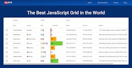
2. Examples of table design
Here are examples from my practice. I drew a lot of tables, and, depending on the situation, I used all the techniques listed above. Usually several are used at once, below I will show such complex cases.


3. Further development of tables
In order to make tables even more convenient and beautiful - in some cases, you can replace them with graphs and diagrams, or embed small graphical elements in the table. I will tell you about these techniques in the next article, which I will publish in the near future.


Thanks for your attention!

L O A D I N G
. . . comments & more!
. . . comments & more!